Measuring The Impact of A Fare Hike
2013
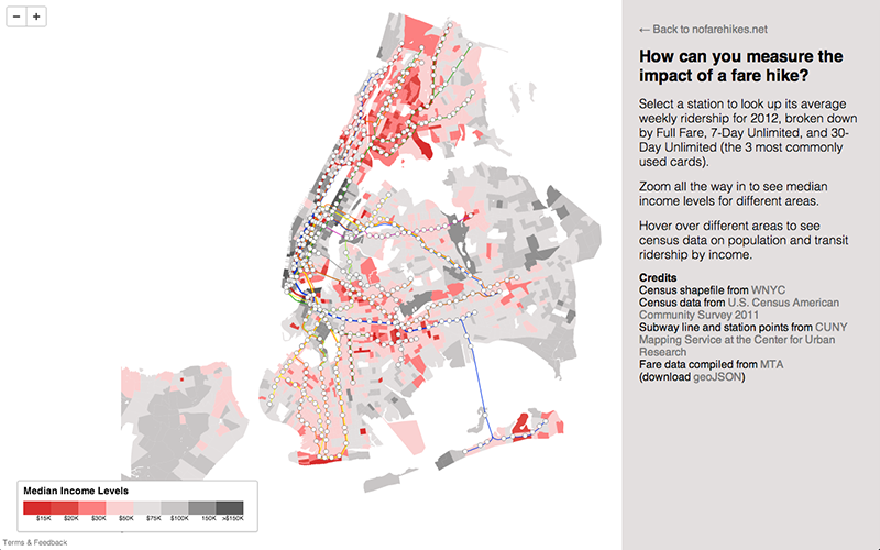
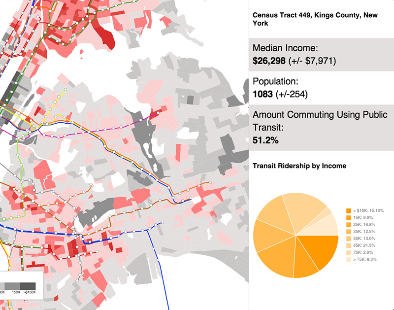
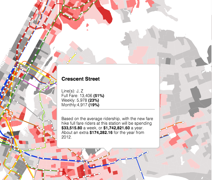
How do you understand the impact of a fare hike on a city, on a neighborhood, on a community? Using MTA ridership data and American Community Survey data, this map explores one different way of measuring that impact.
This was part of a campaign that was well-intentioned but pretty small and oriented around an incredibly wonky angle for challenging fare increases. We did get some press for it at the time. Unfortunately, biannual fare increases are an unbelievably hard thing to mobilize people around!
You can view the actual interactive here. I am astonished that it still works, to be honest, this API is hella deprecated.